
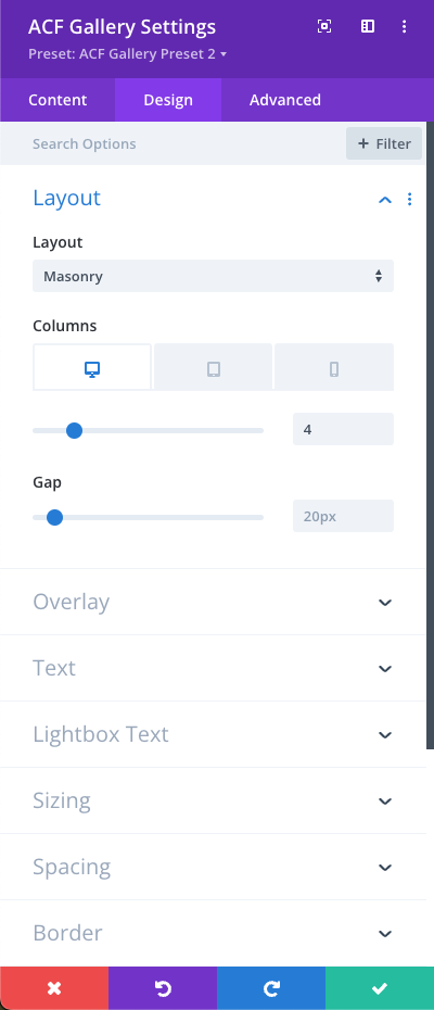
The Layout design section allows you to control how your gallery structure is organized and displayed on the page. You can select from three core layout styles, each with its own customization controls:
- Mini Masonry: This layout uses the maximum width of the images to automatically determine the number of columns shown across different screen sizes. You can set the custom column gap and enable "minify mode," which intelligently places items into the shortest column or preserves the exact original sequence of your image list.
- Masonry: Organizes your images in a classic masonry grid style. You can explicitly define your desired number of columns and spacing gaps.
- Grid: Displays items in a clean, uniform grid arrangement. You can easily control the number of columns and column gaps to match your exact design needs.
0 Comments