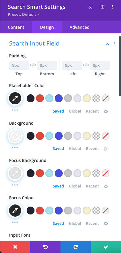
The Search Input Field section under the Design tab empowers you to fine-tune the visual styling and behavior of the input field, ensuring seamless integration with your website’s aesthetics.
- Padding: Control spacing within the input field to balance comfort and clarity. Top / Bottom / Left / Right: Set independently, defaults to 8px each.
- Color Customization. Customize the field’s appearance across normal and focus states:
- Placeholder Color: Defines the text color of the placeholder prompt.
- Background: Controls the input’s default background color.
- Focus Background: Alters the background when the input is active.
- Focus Color: Sets text color during focus for clear visibility.
- Input Font: Select a font style for text entered in the input field. Inherits from global font settings unless overridden. Combine with padding and color settings for a refined typographic look.

0 Comments